Let's learn web display from the printers!
We can talk a lot about the basic ideas and rules of design, but we often don't put enough emphasis on typography, even though it is a defining and essential element of a website, just like a print.
The structure of a page, its acceptability, processability and retention of attention for people are greatly influenced by the text hierarchy.
For example, by properly and uniformly placing and sizing the titles and sub-titles, it is easy to direct the readers' attention to the more important content on the page. For this reason, for example, a main title cannot have the same font size or font as the subtitle or article description.
It is advisable to use a completely different font for the headlines, for example, if our description is a serif font, then the headline can be a sans serif font, or if it fits the website's image, it can even be a written font, i.e. Script.
In general, it is worth using 2, maximum 3 fonts. If we use too many fonts, we will not get a uniform image.
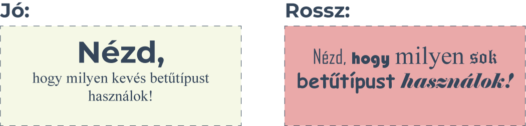
Reading is greatly facilitated by using serif fonts for longer texts, because the serifs on the letters help our eyes to follow the lines. Titles, on the other hand, are shorter, so we can usually use a completely different font without serifs.
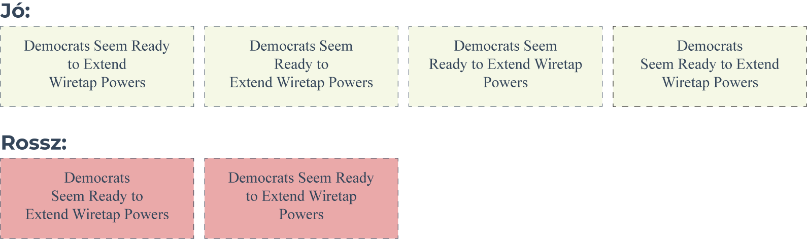
When arranging longer texts, it is not beneficial to use justified or centered alignment, because they easily cause the lines to run together and we lose track of where we were reading, so it is only worthwhile to deviate from the left-aligned text in strongly justified cases.
Shorter, e.g. 3-line texts can be arranged in the middle so that they are easy to read, but in this case the rule of Dreizeilenfall comes into play.
If the centered text has three lines, it must be arranged according to the rules shown below for easier readability:
- A shorter line can be followed by a longer one
- A longer line can be followed by a shorter one
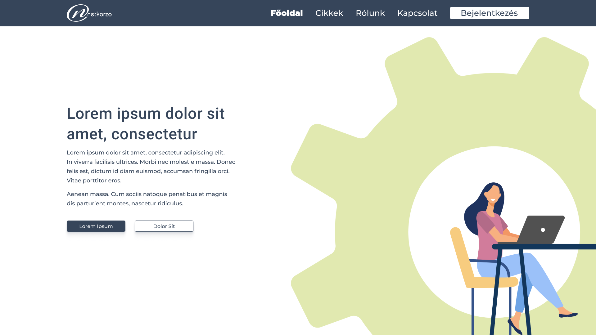
Even the colors are part of the uniformity of the text. For example, it can be confusing if most of our text is dark gray, titles are blue, document titles are red, image descriptions are green, and menu background color is yellow. Using mismatched colors or too many colors disrupts coherence, the reader will not be able to identify the meaning or pattern associated with the colors. Instead of choosing random colors, you should choose a color theme and decide what color the elements should be. This usually means 2-3, maximum 4 colors. These 2-4 colors include, for example, the description and title of the article, the background color of the menus, the background color of the buttons, the color of the links, or the color of the files.
It is also not worth using minimally different colors that are too similar to each other, because our eyes will notice the difference and will only perceive it as a mistake. Therefore, strongly different, but compatible and legible colors based on the rules of color theory must be used.
The easiest way to illustrate this is with an example; in the image below, only two colors are used except for the graphic element.
It is easily transparent, the colors do not fight with each other, the text hierarchy guides the eye.
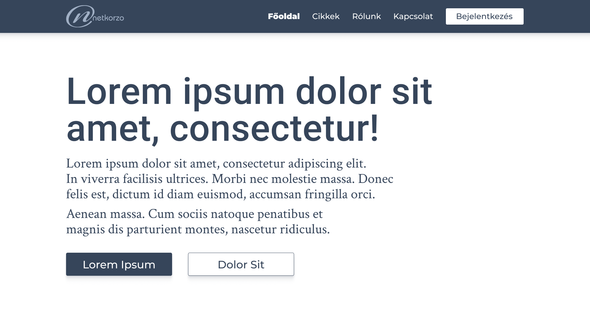
With the help of appropriate fonts, text sizes, spaces and harmonious colors, a website or an article can feel complete and aesthetic, even if there are no graphic elements on it. The example below is a completely clean, minimalist design. Apart from the logo, there are no graphic elements on it, yet the arrangement of the text guides our eyes.
On the subject of design, we also recommend the following articles for your attention:
Principles of good design
Let's learn web display from the printers!
We can talk a lot about the basic ideas and rules of design, but we often don't put enough emphasis on typography, even though it is a defining and essential element of a website, just like a print.
The structure of a page, its acceptability, processability and retention of attention for people are greatly influenced by the text hierarchy.
For example, by properly and uniformly placing and sizing the titles and sub-titles, it is easy to direct the readers' attention to the more important content on the page. For this reason, for example, a main title cannot have the same font size or font as the subtitle or article description.
It is advisable to use a completely different font for the headlines, for example, if our description is a serif font, then the headline can be a sans serif font, or if it fits the website's image, it can even be a written font, i.e. Script.
In general, it is worth using 2, maximum 3 fonts. If we use too many fonts, we will not get a uniform image.
Reading is greatly facilitated by using serif fonts for longer texts, because the serifs on the letters help our eyes to follow the lines. Titles, on the other hand, are shorter, so we can usually use a completely different font without serifs.
When arranging longer texts, it is not beneficial to use justified or centered alignment, because they easily cause the lines to run together and we lose track of where we were reading, so it is only worthwhile to deviate from the left-aligned text in strongly justified cases.
Shorter, e.g. 3-line texts can be arranged in the middle so that they are easy to read, but in this case the rule of Dreizeilenfall comes into play.
If the centered text has three lines, it must be arranged according to the rules shown below for easier readability:
- A shorter line can be followed by a longer one
- A longer line can be followed by a shorter one
Even the colors are part of the uniformity of the text. For example, it can be confusing if most of our text is dark gray, titles are blue, document titles are red, image descriptions are green, and menu background color is yellow. Using mismatched colors or too many colors disrupts coherence, the reader will not be able to identify the meaning or pattern associated with the colors. Instead of choosing random colors, you should choose a color theme and decide what color the elements should be. This usually means 2-3, maximum 4 colors. These 2-4 colors include, for example, the description and title of the article, the background color of the menus, the background color of the buttons, the color of the links, or the color of the files.
It is also not worth using minimally different colors that are too similar to each other, because our eyes will notice the difference and will only perceive it as a mistake. Therefore, strongly different, but compatible and legible colors based on the rules of color theory must be used.
The easiest way to illustrate this is with an example; in the image below, only two colors are used except for the graphic element.
It is easily transparent, the colors do not fight with each other, the text hierarchy guides the eye.
With the help of appropriate fonts, text sizes, spaces and harmonious colors, a website or an article can feel complete and aesthetic, even if there are no graphic elements on it. The example below is a completely clean, minimalist design. Apart from the logo, there are no graphic elements on it, yet the arrangement of the text guides our eyes.
On the subject of design, we also recommend the following articles for your attention:
Principles of good design